A warm-toned design system study for learning platforms, engagement products, and progress-driven interfaces. The work demonstrates component thinking, visual hierarchy, responsive patterns, and reusable UI decisions.
This reference sheet shows the design language, component families, visual tokens, and UI patterns that make the system reusable across learning and engagement products.
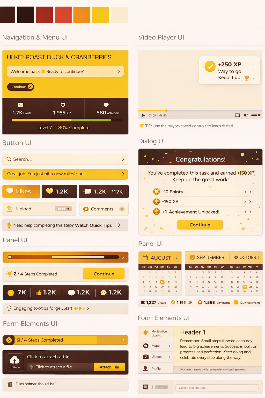
The system explores how color, components, hierarchy, and responsive UI patterns can support gamified learning or progress-driven applications without sacrificing clarity or accessibility.
The challenge was to show product craft at the component level: reusable pieces, variants, responsive behavior, accessibility awareness, and a cohesive visual language.
Defined components, variants, palette, responsive behavior, and interaction patterns that could support multiple product surfaces.
The system gives product teams UI tools for goals, rewards, lessons, profiles, navigation, and engagement feedback.
Instead of one-off screens, the work demonstrates repeatable visual rules and component structure that can support future product buildout.
Leadership signal: This work demonstrates senior product craft through design-system thinking: tokens, components, responsive patterns, visual hierarchy, and accessibility. For Fluxon, it helps prove that the portfolio is not only strategy-heavy but also capable of polished, scalable interface design.
The system turns a visual direction into reusable parts that can support multiple screens and user states.
The components are built around learning, gamification, and feedback loops.
Color, spacing, component rhythm, and accessibility claims are presented as product design decisions, not decoration.