Product Screens & Design Rationale
6 screens · mobile product craft▶ Launch PrototypeOpens interactive prototype in a new tab
Group 01
Polished Mobile Interface Screens
These screens show the final mobile direction: splash, sign-in, dashboard, news feed, and the full-screen composite of the experience.
Product Screen 01
Hi-Fi Composite — All Screens
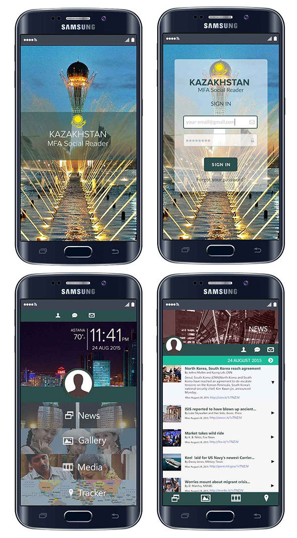
High-fidelity composite showing all four primary app screens side by side — Splash, Sign-In, Dashboard, and News Feed — rendered on Samsung Galaxy hardware for presentation context.
View Full Image ↗
Design rationale: The composite gives reviewers a system-level view of the final mobile direction, showing consistency across key states.
Product Screen 02
Splash Screen
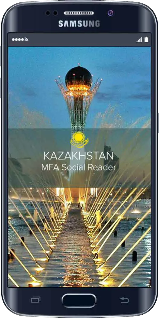
App launch screen featuring the Kazakhstan national emblem and MFA Social Reader branding over a full-bleed photographic backdrop of Astana's iconic Baiterek monument and fountains.
View Full Image ↗
Design rationale: The splash screen sets an official product tone while keeping entry focused and lightweight.
Product Screen 03
Sign-In Screen
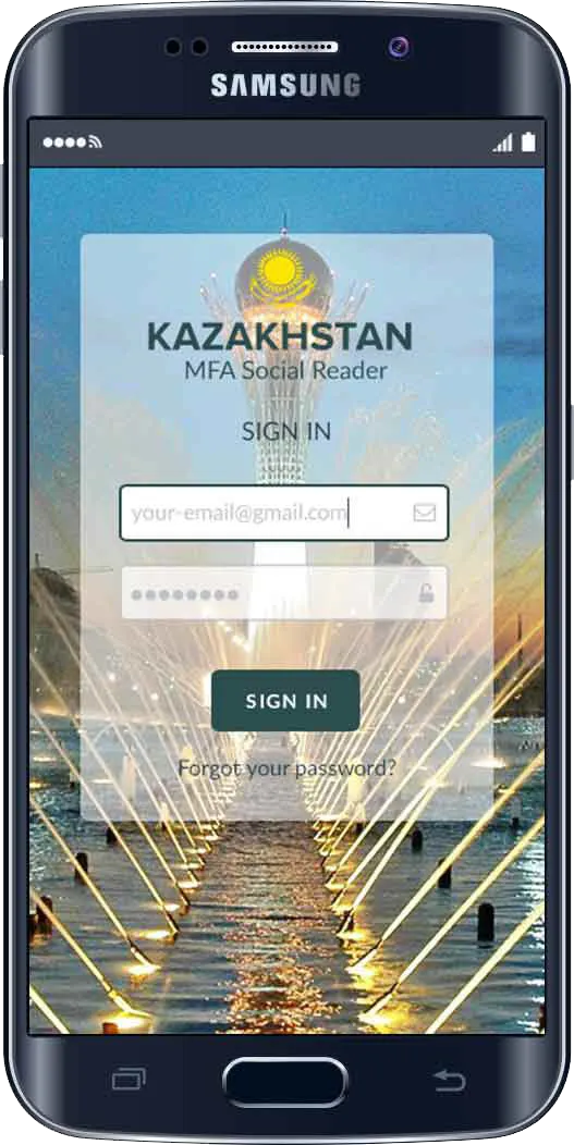
Authentication screen with email and password input fields, a high-contrast Sign In CTA, and a password recovery link — all layered over the translucent Kazakhstan branding panel.
View Full Image ↗
Design rationale: The sign-in screen keeps authentication simple and direct, reducing friction before users reach the dashboard.
Product Screen 04
Dashboard
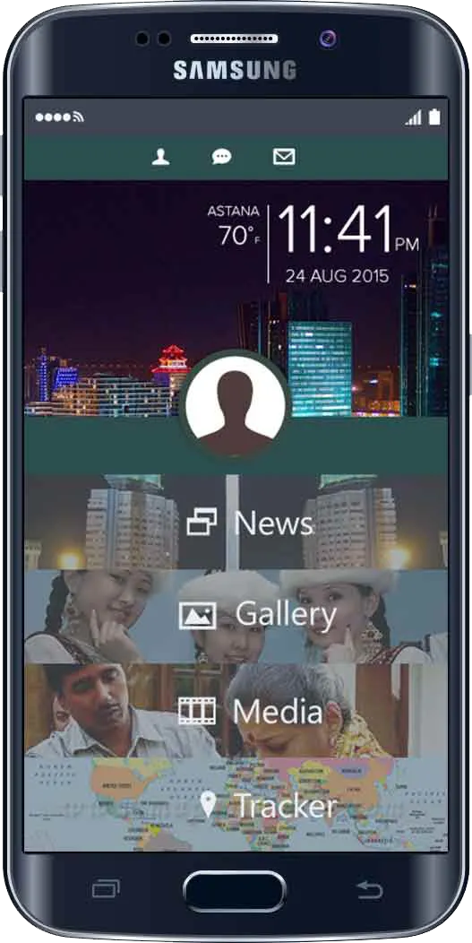
Main navigation hub displaying real-time Astana weather and date, user profile access, and four primary content sections — News, Gallery, Media, and Tracker — using full-bleed imagery as navigation panels.
View Full Image ↗
Design rationale: The dashboard acts as the user’s orientation hub, presenting content pathways without overwhelming the mobile viewport.
Product Screen 05
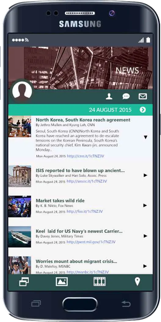
News Feed
Live news feed screen aggregating international headlines from CNN, Associated Press, Fox News, and Military Times — with thumbnail images, bylines, source URLs, and a date-stamped header bar.
View Full Image ↗
Design rationale: The feed view prioritizes readable content, scanability, and quick access to current information.
Group 02
Wireframe Foundation
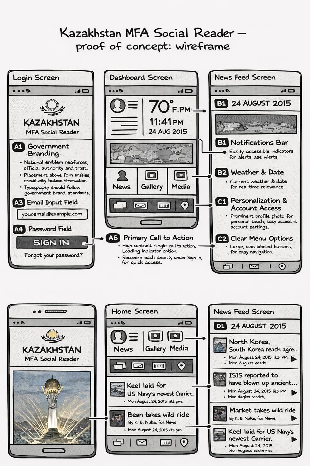
The early proof-of-concept wireframe shows the structure, navigation, and screen logic that informed the final mobile product direction.
Strategy Artifact 01
Lo-Fi Wireframe — Proof of Concept
Early-stage proof of concept wireframe spanning the Login, Dashboard, and News Feed screens. Includes annotated callouts for government branding, input fields, primary CTA, personalization, and clear menu navigation patterns.
View Full Image ↗
Design rationale: The early wireframe establishes the structure and navigation logic before the interface moves into visual polish.