English Learner
Family Toolkit
Turning four static federal PDFs into a secure, multilingual mobile toolkit for underserved English learner families. Now shipped and in public use, available in Arabic, Chinese, English, and Spanish.
The Tested,
Clickable Product
Round two. A live, interactive prototype built after user testing and folded into the package handed to developers. Tap through the flow a family actually takes, from choosing a language to reaching the toolkit content that started as four static PDFs.
Tap-Through, Not Tell
A working prototype let people experience the flow instead of hearing it described. That is the same move that won the proof of concept, repeated once research told us what to build. Feedback got sharper because the thing being tested was real.
Language Before Everything
The prototype front-loads language choice. A family that cannot read the content has no reason to go further, so the flow settles that first and clears the barrier before it can stop anyone.
Secure, Low-Friction Entry
Access is protected without turning the front door into a gate. Watch how the entry stage handles security for a low-trust audience without stacking up steps that would cost the very patrons the mandate set out to reach.
Prove the Idea
Before Asking for Budget
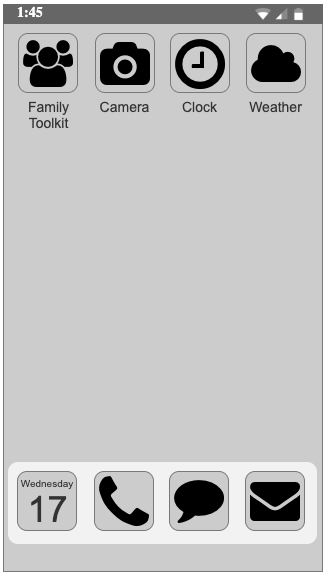
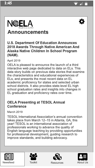
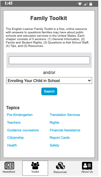
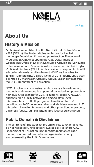
The mandate was one line. Do more outreach, reach more patrons, especially the underserved. I answered it with a working concept, not a slide deck. Five Sketch screens that executives could walk through, screen by screen, before a dollar was committed.
Loads from
horizonsplash.com
Loads from
horizonsplash.com
Loads from
horizonsplash.com

Loads from
horizonsplash.com
Loads from
horizonsplash.com
Show, Don't Pitch
I built the concept in Sketch and navigated executives through each screen live. I explained the purpose of every screen and the decisions a user would face. The proposal stopped being a discussion. It became a product they could see and tap.
De-risking an Ambiguous Mandate
The ask was vague. Reach more underserved patrons with only four PDFs to work from. A proof of concept turned that ambiguity into something concrete enough to fund. A mobile app was the means, not the goal. Experience and efficiency were the goal.
Two Hard Problems, Named Early
Getting the information to families securely, and making it accessible across languages. Both were surfaced inside the concept, so stakeholder buy-in came with eyes open rather than as a promise to solve them later.
Testing First, Then
Personas and Journey
Once funded, we recruited and tested real users. The personas and journey map here are outputs of that testing, not guesses that came before it. Testing came first. Everything after it is evidence.
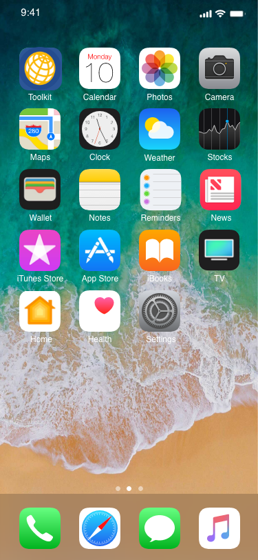
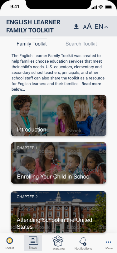
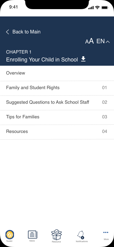
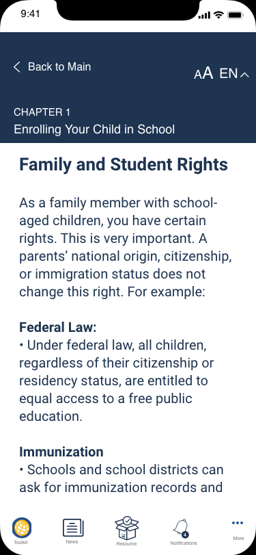
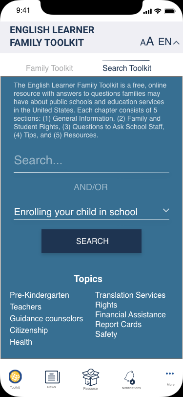
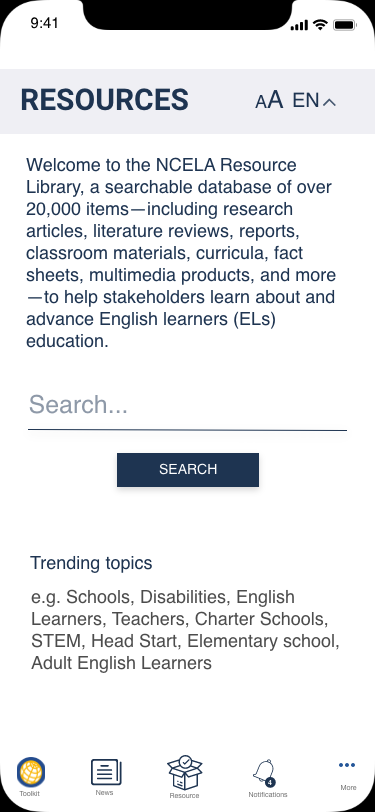
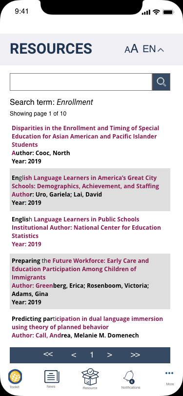
These eight screens were the instruments for moderated testing, built to study behavior and sentiment: how families read the content, how they searched, and how they handle a mobile app in general. They were made to learn from, not to ship.
The launched app diverged from them. Compliance review and stakeholder needs drove many changes on the way to development, so these are research artifacts, not a preview of the final UI.
Loads from
horizonsplash.com

Loads from
horizonsplash.com
Loads from
horizonsplash.com
Loads from
horizonsplash.com
Loads from
horizonsplash.com
Loads from
horizonsplash.com
Loads from
horizonsplash.com
Loads from
horizonsplash.com
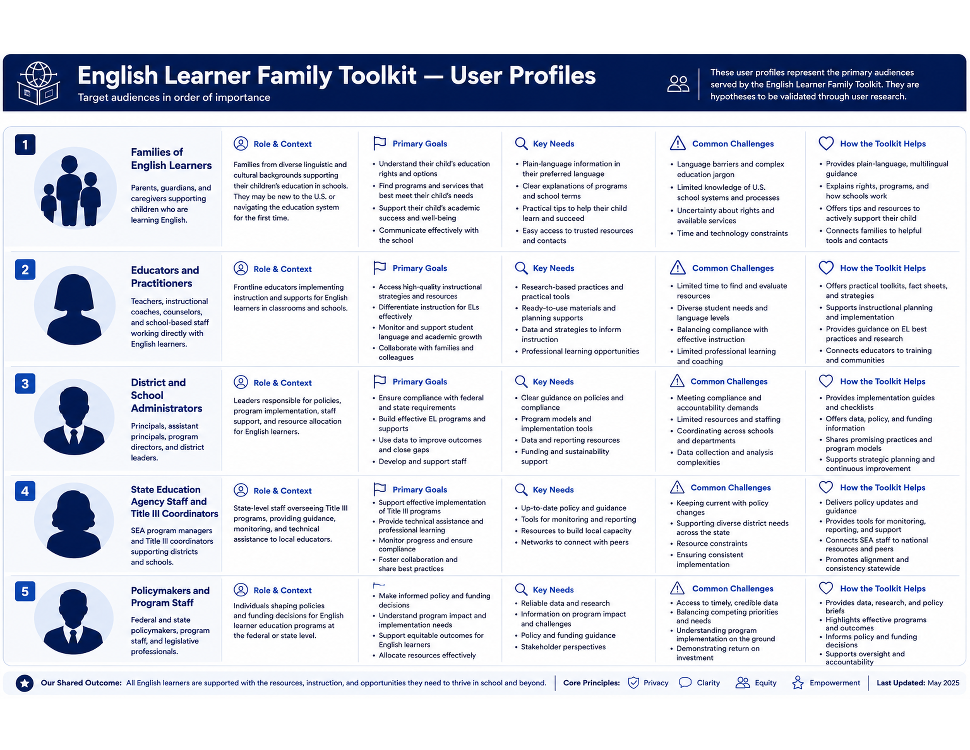
Testing produced personas grounded in how these families actually live, read, and access information, not in how we assumed they did.
Loads from horizonsplash.com
Research After Funding
Personas came out of surveys and user testing conducted once the project was funded, not from a whiteboard. Recruiting and testing real patrons anchored every later decision in evidence instead of instinct.
Language Is the First Barrier
Accessibility here was not a checkbox. If a family cannot read the toolkit in their language, the outreach fails before it starts. That constraint cut across every persona and shaped the app's first real decision point.
Access Has to Feel Safe
These families weigh trust carefully. Delivering sensitive information to them securely was a design requirement, not an afterthought, and it shaped how each persona's path through the app was built.
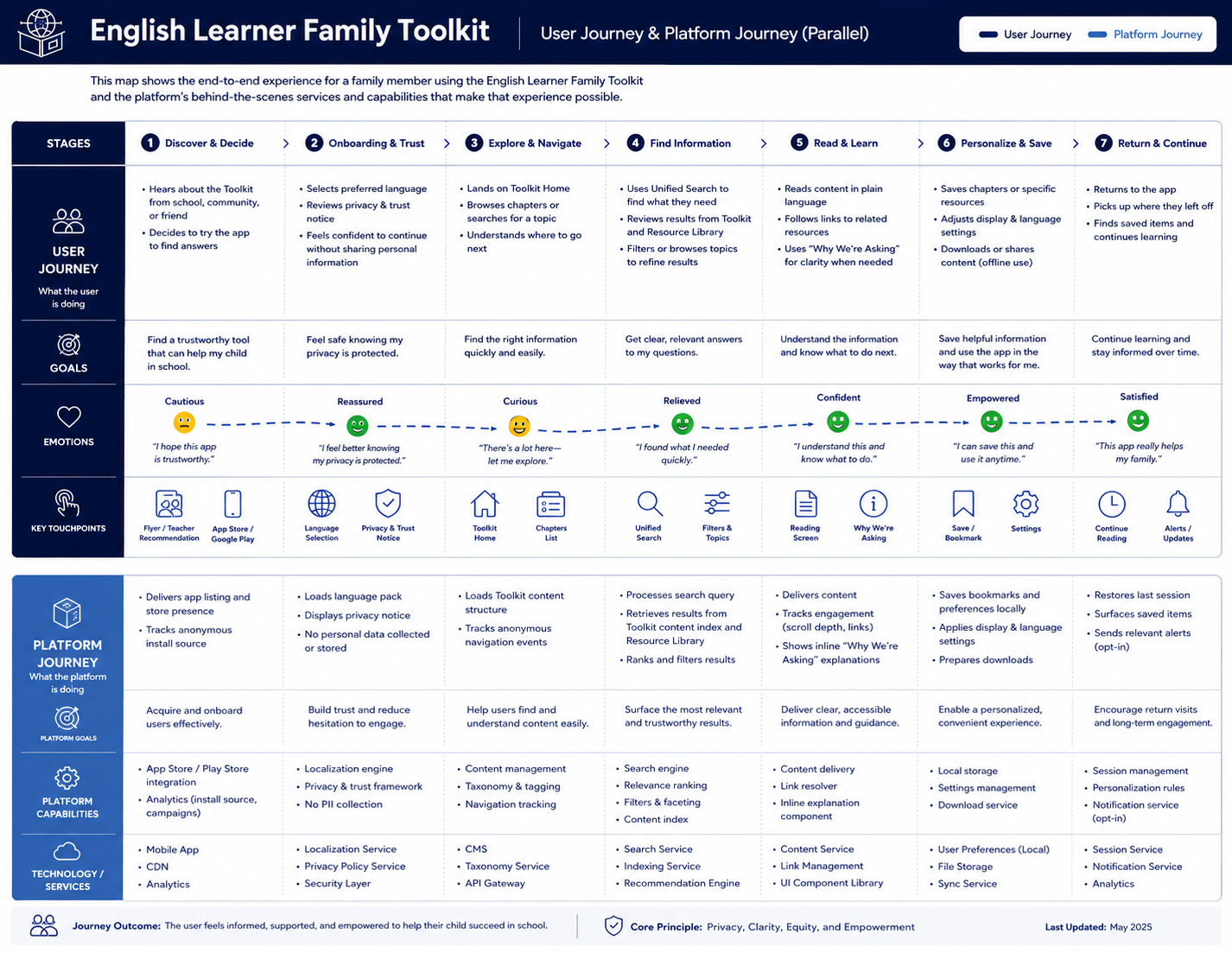
The same testing mapped what a family does and needs across the flow, from first open to the moment they return, and where each stage carried a trust, language, or clarity risk.
Loads from horizonsplash.com
Language Choice Comes First
Language selection sits near the front of the journey, not buried in settings. A family that cannot read the content has no reason to continue. Putting the choice up front removes the barrier before it can stop anyone.
Security Without Friction
Secure access was non-negotiable, but heavy security kills adoption for a low-trust audience. The journey isolates the access stage so protection could be added without turning entry into an obstacle course.
Built to Return To
The toolkit is reference material, not a one-time read. The journey ends on Save & Return so families can come back to the exact resource they need, which is the behavior that turns outreach into ongoing value.
Wireframes That
Became the Build
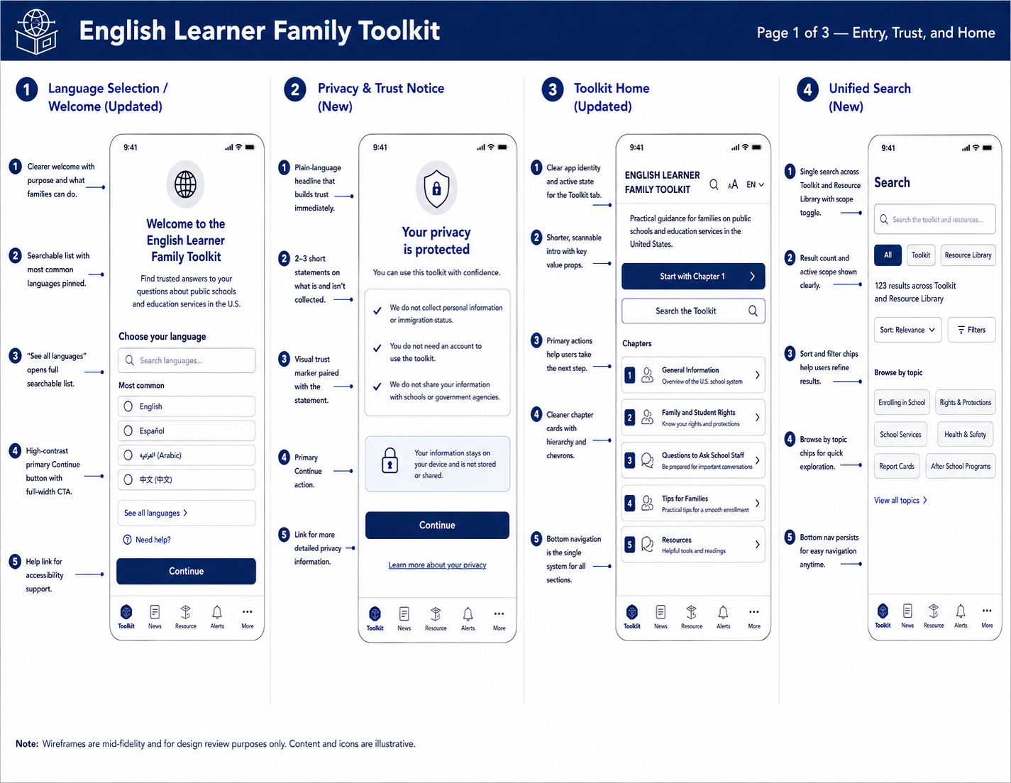
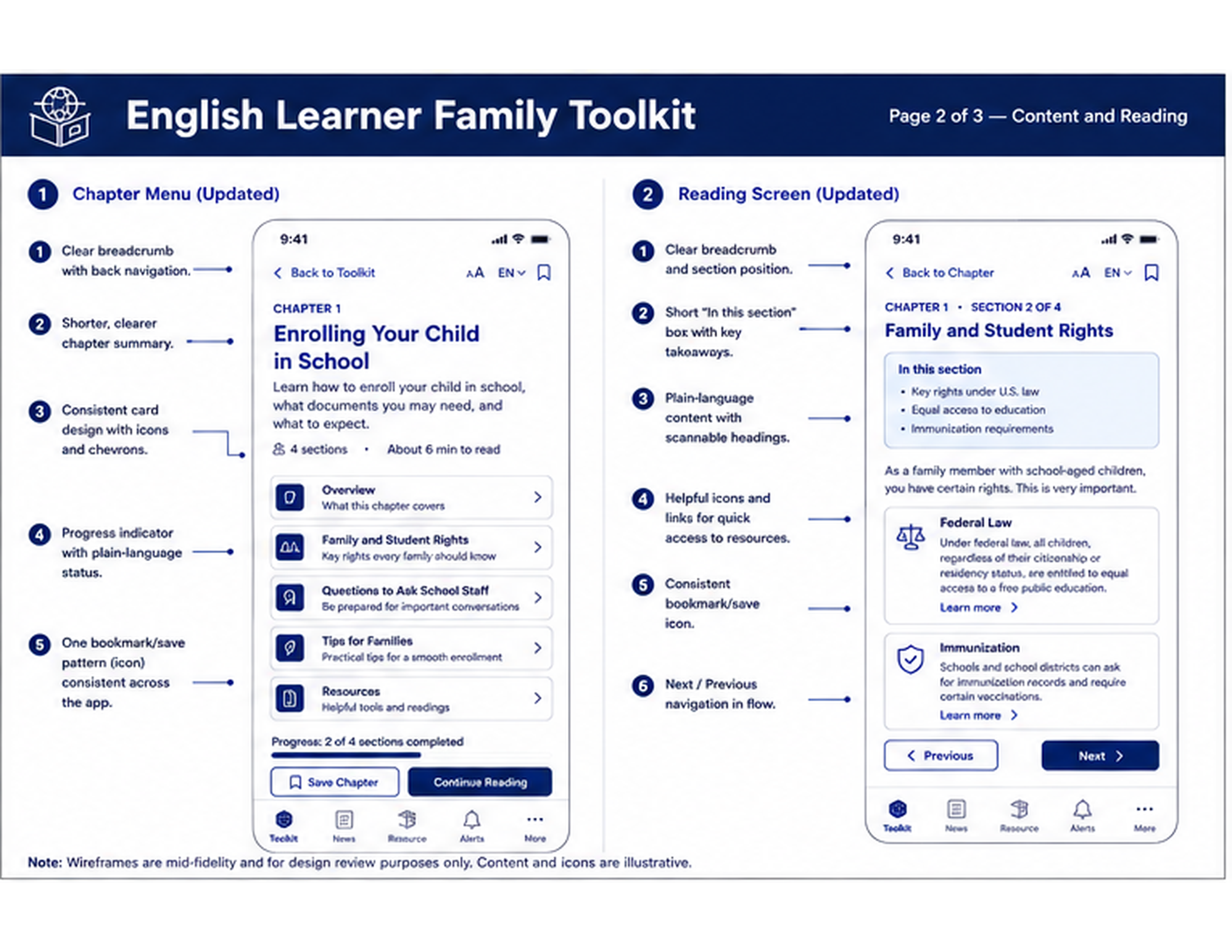
These wireframes translated the tested concept into structure. They fed a live, interactive prototype in round two, and shipped as part of the package handed to developers and programmers, with stakeholders kept inside the loop through sign-off.
Loads from horizonsplash.com
Loads from horizonsplash.com

Loads from horizonsplash.com
Tested Concept to Buildable Spec
The wireframes took what testing validated and gave it structure. This was round two after the proof of concept. More data, a more acceptable version, and a layout developers could build against without guessing intent.
Made for Developers
The live interactive prototype and these wireframes went into the handoff package for developers and programmers. Nothing about the build was left to interpretation, and stakeholder sign-off stayed part of the circle throughout.
It Went Live
The EL Family Toolkit shipped as a public app for the U.S. Department of Education, built by Manhattan Strategy Group. The live product carries the design system and visual assets I built from the original screens and flow, now in families' hands in four languages.