Fullerton Hotel
Booking Experience
Luxury booking UX, mobile conversion flow, and premium interaction design
Booking Journey
from Browse to Confirmation
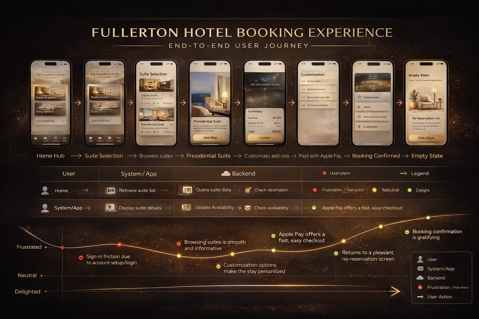
Journey map showing screens, system interactions, and the emotional arc across the full booking flow — from first interest through room selection, checkout, and confirmation.
Loads from horizonsplash.com
Full Arc Visibility
Maps the complete experience from first consideration to post-confirmation — making friction points visible before they become problems.
Three-Layer Structure
Screen flow, system activity, and emotional arc run in parallel — showing how backend latency and form errors translate directly into user sentiment drops.
Payment Is the Friction Peak
The emotional arc dips sharpest at payment entry. Trust signals and progressive form disclosure were identified as the highest-priority fixes.
7-Step Mobile Booking
Structure
Structure-first wireframe set mapping every screen from home hub to booking confirmation — resolving layout, hierarchy, and decision flow before visual design began.

Loads from horizonsplash.com
Structure Before Style
Lo-fi was built to resolve layout and flow decisions independently of visual design — keeping stakeholder feedback focused on what matters at this stage.
Progressive Disclosure
Each screen surfaces only what the user needs at that step. Room pricing is withheld until selection. Payment breakdown only appears at checkout.
One CTA Per Screen
Every screen has a single primary forward action. No screen competes with itself — reducing decision fatigue across all 7 steps of the flow.
Fullerton Booking App
Live Mobile Prototype
Live prototype of the full mobile booking flow. Navigate the experience directly in the device frame to review interaction patterns, transitions, decision points, and confirmation behavior.
Flow Continuity
Each screen transitions into the next without dead ends. The prototype validates that the 7-step journey map translates cleanly into a working interface.
Interaction Patterns
Note the progressive disclosure at each step — filters, room details, and payment fields appear only when the user is ready for them.
Confirmation Moment
The final screen is designed to close on a high — reflecting the delight peak identified in the journey map at the booking confirmed stage.