Capital One
Builder Program
Trust-centered onboarding, financial behavior design, and mobile product rationale
Designing for Trust
Before Conversion
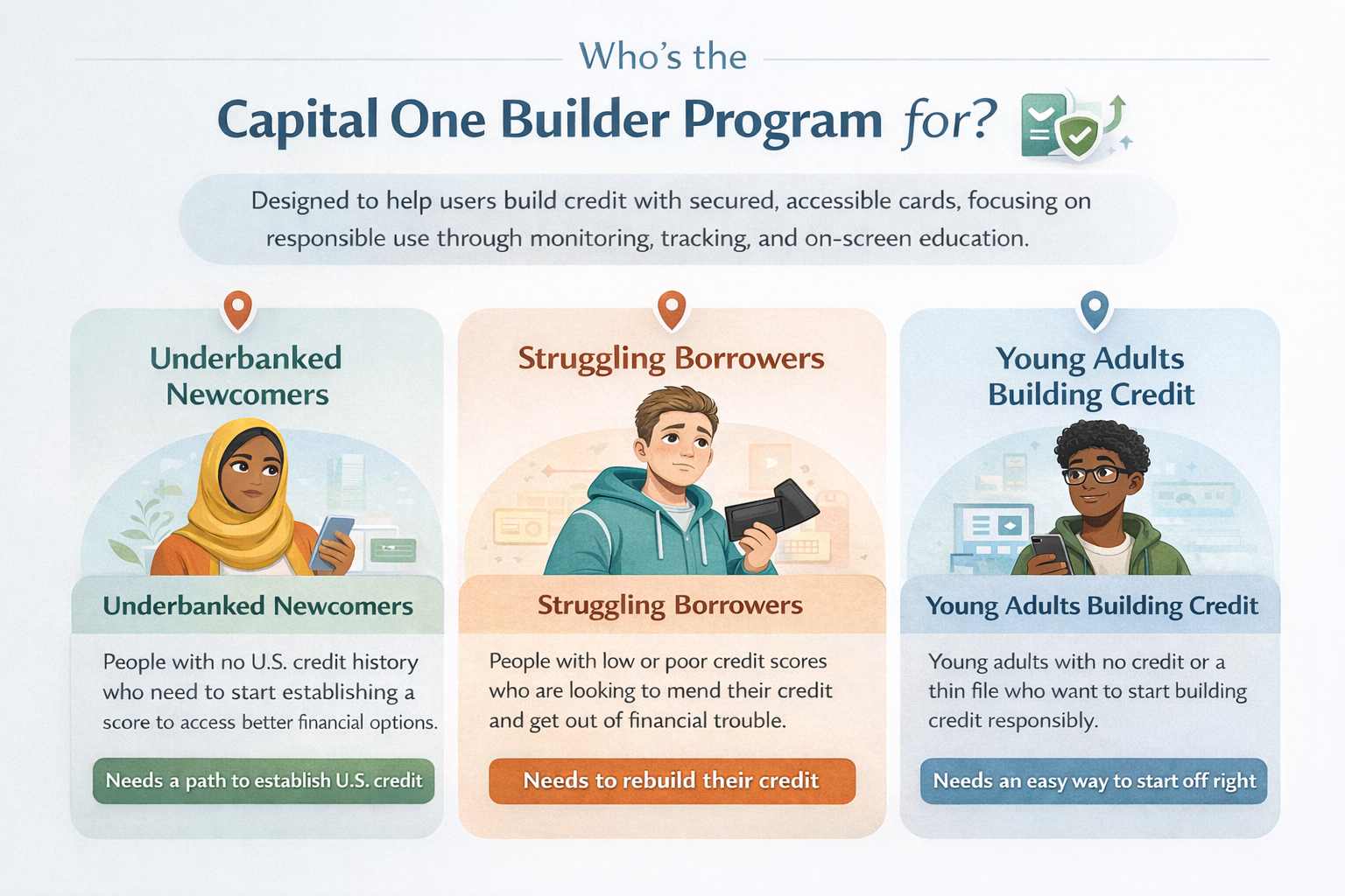
Three distinct user archetypes — each with different levels of financial literacy, credit history, and emotional readiness — all converging on the same need: a clear, safe path to build credit without feeling judged or trapped.
Loads from horizonsplash.com
One Flow, Three Mental Models
All three personas move through the same 7-phase onboarding sequence, but the emotional stakes are completely different. The interface had to earn trust from someone who has never had U.S. credit, reduce anxiety for someone who has failed before, and feel approachable for someone just starting out.
Trust Before Data Collection
Every persona must provide SSN, employment details, and bank credentials before approval. The prototype sequences trust-building elements — the 256-bit encryption badge on S2, an SSN notice on S3, and two alternative bank linking paths on S17 — specifically before each sensitive data request.
Shared Anxiety, Different Trigger
Newcomers worry about identity theft. Struggling Borrowers worry about repeating past failures. Young Adults worry they're making the wrong move. The card sort revealed these as three versions of the same fear — leading to contextual trust signals placed at the exact moment each persona's specific anxiety peaks, not in a generic footer.
From Interest
to Account Confidence
End-to-end emotional arc mapping what users do, think, and feel across sign-up, sensitive data entry, terms, bank linking, dashboard use, and missed-payment recovery — with product decisions tied to each trust risk.
Loads from horizonsplash.com
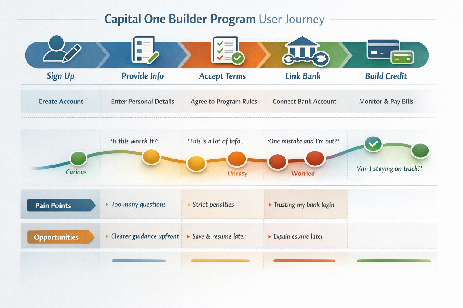
Map the Dip, Fix the Dip
Every sentiment dip was treated as a screen-level design problem. The Provide Info dip drove the decision to split personal information across three screens (S3, S4, S5) with a single clear purpose each, rather than one long scrollable form — directly targeting the "too many questions" pain point.
Three Distinct Friction Peaks
Too many questions on Sign Up, strict penalty language on Accept Terms ("One mistake and I'm out?"), and bank login trust on Link Bank. The journey map isolated these so each could receive a targeted fix — screen splitting, a visual checkbox checklist, and two alternative linking methods respectively.
Save & Resume Prevents Drop-Off
The Provide Info and Link Bank phases are the longest in the flow. If a user exits mid-way, losing all progress is a critical failure. The prototype addresses this with explicit step progress dots and phase labels that anchor users' place — making the flow feel finite and recoverable rather than endless.
Mental Models
Behind the Flow
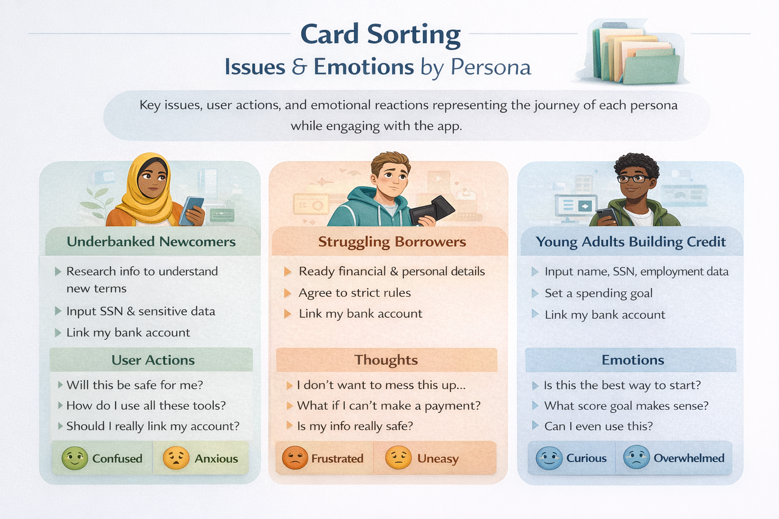
Card sorting exercise mapping issues, actions, and emotional reactions for each persona — revealing the hidden expectations users bring into the onboarding flow before they tap anything.
Loads from horizonsplash.com
Emotions as Navigation Signals
Rather than sorting by feature category, the card sort organized by emotional state. Confused and Anxious users need different screen pacing than Frustrated or Overwhelmed users — even when completing the same form. This drove single-purpose screens over combined steps throughout the prototype's 31-screen flow.
Safety Is the Universal Unlock
Every persona needed safety reassurance before they could proceed comfortably — but each framed it differently. This led to the 256-bit SSL badge on S2, the encryption notice before SSN on S3, the two-path bank linking on S17 (instant login OR manual routing entry), and the "all set" confirmation modal after linking before asking to activate the card.
Contextual Trust, Not Generic Footers
The card sort pinpointed exactly when each persona's anxiety peaks during the flow. That's why trust signals in the prototype appear as inline banners immediately before the specific field that triggers concern — SSN entry, bank login, and the penalty agreement checkbox on S6 — rather than passively sitting in a terms footer.
31-Screen Mobile
Product Prototype
A full mobile prototype covering account setup, personal information, terms, identity verification, onboarding, bank linking, dashboard states, and missed-payment recovery. The prototype shows the complete product logic, not just isolated screens.
The Onboarding Sequence (S11–S16)
After approval, navy screens S11–S16 walk users through program rules before dashboard access. Two payment tracker visuals — 5 green checks for graduation, 2 checks + 3 red X's for failure — make consequences tangible before the user has made a single payment. The vertical score slider on S15 sets personal stakes immediately after onboarding.
The Bank Linking Flow (S17–S23)
S17 shows eight banks with instant login modals. S19–S23 show the manual routing path in four progressive states — empty, routing detected (with auto-filled bank name), dropdown open, and fully complete. Two paths serve two trust levels. The "You're all set" modal closes the anxiety loop before asking to activate the card via CCV entry.
The Missed Payment Path (S27–S31)
Navigate to S27 to see the JUN missed payment on the dashboard, then continue to the red-screen sequence. The extended tracker on S29 visually adds 6 more empty months after the missed slot — making the extended timeline concrete without shame-based language. S31 shows the recovery dashboard with a restored 22% utilization score and overdue payment label.