Capital One Builder Program — Credit Onboarding Redesign
All 3 friction peaks resolved — complete 31-screen flow designed and prototyped end-to-end
End-to-end redesign of a secured credit card onboarding flow for users who have every reason to distrust the system — with trust built through sequencing and context, not marketing copy.
Client: Capital One · Scope: End-to-end mobile onboarding, research & prototyping · Year: 2016
31
Screens Prototyped
3
Distinct User Personas
7
Onboarding Phases
4
Research Artifacts
This wasn't a forms problem — it was a trust problem. Users were asked for their SSN before the app gave them a reason to trust it. I mapped the emotional arc across the flow, ran a card sort organized by emotional state rather than feature, and used those findings to redesign onboarding around three friction peaks: sign-up overload, SSN anxiety, and a bank-linking path that excluded manual account holders. The result was a 31-screen prototype where every structural decision traces back to a specific research finding.
The Capital One Builder Program is a secured credit card product targeting people with no credit history, damaged credit, or limited banking access. The core value proposition is straightforward: make consistent monthly payments for 12 months, graduate to an unsecured card. But the onboarding flow wasn't doing the product justice.
Users were landing in a 7-phase application process that front-loaded data collection before establishing any trust. SSN entry, employment details, and bank account credentials were all required before a user received a single piece of reassurance. For the specific population this product serves — people who have been burned by financial systems before — that sequencing created predictable friction.
The core challenge: Design an onboarding flow that earns trust from users who are skeptical of financial institutions, anxious about their credit situation, and — for a meaningful segment — new to U.S. banking entirely. The interface had to answer three different users' unspoken questions simultaneously, without asking which one applies.
Where the Flow Was Breaking Down
Sign-Up Drop-Off
Too many questions combined on a single screen. Cognitive overload before a single trust signal appeared.
SSN Entry Abandonment
Users asked to submit sensitive identity data before the interface established any credibility. High drop-off with no recovery path.
Terms Screen Anxiety
Penalty language read as all-or-nothing consequences. User reaction: "One mistake and I'm out?"
Bank Linking Failure
Single authentication path excluded manual account holders. Users who couldn't use instant login had nowhere to go.
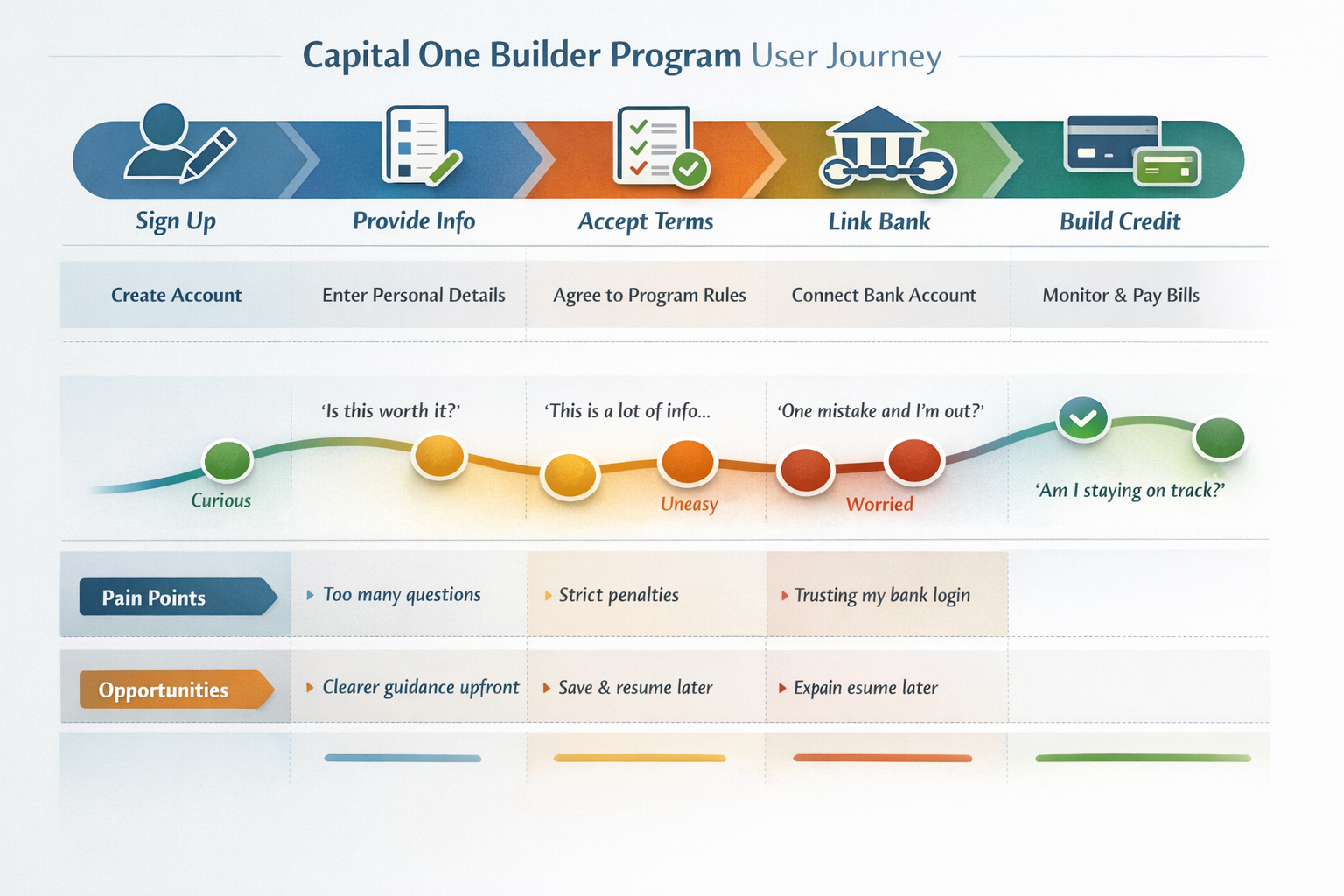
The journey map identified three distinct friction peaks: too many questions at sign-up, fear-inducing penalty language on the terms screen, and trust failure at bank linking. Each was a separate design problem requiring a targeted fix — not a general UX polish pass.
I owned the research plan, journey mapping, persona development, card-sort synthesis, and interaction design for this project end-to-end. Every structural decision in the prototype — the form splits, the dual bank-linking path, the visual penalty tracker, the recovery flow — traces back to a specific finding I surfaced and translated into a design move, not a general best-practice pass.
Leadership signal: I translated emotional risk into product structure — research, interaction design, visual sequencing, and prototyping judgment applied to a business-critical financial onboarding flow for users who have every reason to distrust it.
03 Users & Mental Models
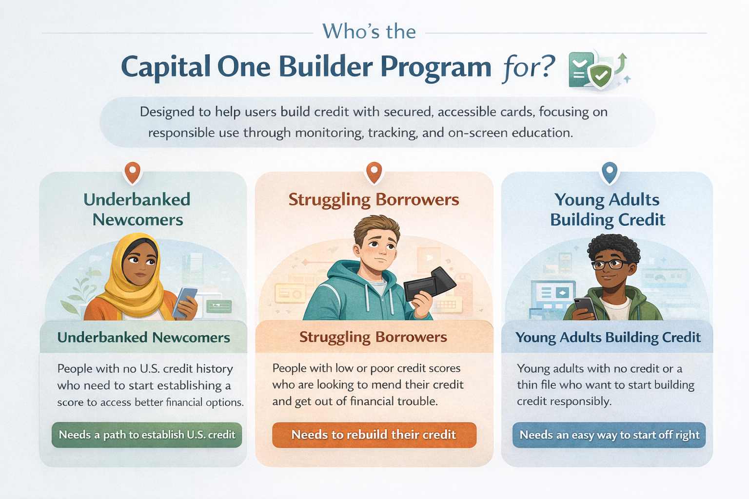
The Builder Program serves a population with genuinely different financial histories, credit situations, and levels of comfort with digital banking. Three distinct personas emerged from the research — each completing the same 7-phase flow, but arriving with a different internal question the interface needed to answer before they could proceed with confidence.
Persona 01
Underbanked Newcomers
No U.S. credit history. May be navigating U.S. banking for the first time. High distrust of systems that have historically excluded them.
"Will this be safe for me?"
Persona 02
Struggling Borrowers
Past credit failures. Damaged history. Anxious about repeating the same pattern — and skeptical that this product is actually different.
"What if I can't make a payment?"
Persona 03
Young Adults Building Credit
No established credit history. Generally comfortable with digital products but unsure if they're making the right financial decision.
"Is this even the right move for me?"
Key insight: Three different fears, one common root. Every persona needed safety reassurance before they could proceed — but each framed "safety" differently. The design response was contextual trust signals placed at the exact moment each persona's anxiety peaks, rather than generic security footers nobody reads.
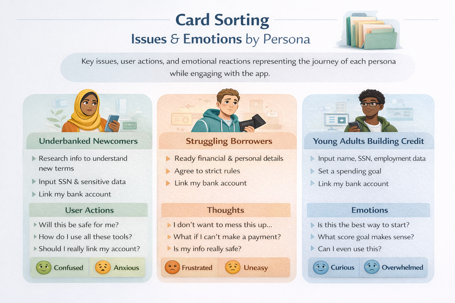
What the Card Sort Revealed
A card sorting exercise mapping issues, actions, and emotional reactions by persona surfaced something critical: each user arrives with a fundamentally different internal question. The interface couldn't ask which one applies — it had to answer all three passively, through the sequencing and framing of individual screens.
This drove a core design principle: the flow must answer unspoken questions before they become reasons to quit. Not through copy that says "we're trustworthy" — through design choices that demonstrate it at the moment of maximum anxiety.
04 Research & Insights
Journey Mapping as a Defect Log
The user journey map tracked the emotional arc across all five phases: Sign Up → Provide Info → Accept Terms → Link Bank → Build Credit. Every sentiment dip in the map was treated as a screen-level design defect — not a general "area of concern," but a specific problem requiring a specific fix.
Journey Phase
Sentiment Shift
Root Cause
Design Response
Sign Up
Curious → Uneasy
Too many questions on a single screen
Split personal info across 3 focused screens (S3–S5)
Provide Info
Uneasy → Worried
SSN entry without prior trust signal
256-bit SSL badge on S2; SSN notice inline on S3
Accept Terms
Worried → Anxious
Penalty language reads as "one strike and you're out"
Single bank auth path excluded manual account holders
Two paths: instant bank login OR manual routing entry
Build Credit
Relieved → Confident
No visibility into consequences of missed payment
Extended 12-month tracker makes recovery timeline concrete
Four Research Insights That Drove Structural Decisions
Trust Architecture
Safety is the universal unlock. Every persona needed reassurance — but each framed it differently. The solution: contextual trust signals placed immediately before the specific field that triggers each persona's anxiety. Not in a footer. At the exact moment of maximum doubt.
Cognitive Load
Single purpose beats combined screens. The sign-up drop-off was solved by splitting combined forms. S3 asks for basic info only. S4 is contact only. S5 is financial info only. Each screen has one job. The flow feels longer in screen count and shorter in effort.
Mental Models
Emotions as navigation signals. The card sort organized design decisions by emotional state, not feature category. Confused and Anxious users need different screen pacing than Frustrated or Overwhelmed users — even when completing the same form step.
Recovery Design
Make consequences concrete, not threatening. The extended timeline tracker on S29 adds 6 visible empty months after a missed slot — making recovery concrete and controllable rather than abstract and scary. No shame language. Just the math, visible.
Research Artifacts
Key Personas · Click to view full size
User Journey Map · Click to view full size
Card Sort · Click to view full size
05 Design Decisions
Every structural decision in the prototype traces back to a specific research finding. The flow was not designed top-down from a feature list. It was built from the defects the journey map surfaced — each friction peak addressed with a targeted intervention.
Form Structure: Single Screen vs. Combined Screen
Long scrollable form
Two-screen split
✓ Three single-purpose screens
The Provide Info drop-off mapped to cognitive overload at a combined personal + financial info screen. Splitting into S3 (basic), S4 (contact), S5 (financial) reduced per-screen burden and made the flow feel finite. Each screen has one clear job. Progress dots anchor the user's position in the sequence.
Bank Linking: Single Path vs. Dual Path
Instant login only
✓ Instant login + manual routing
Manual routing only
S17 shows eight banks with instant login modals. S19–S23 show the manual routing path in four progressive states — empty, routing detected with auto-filled bank name, dropdown open, and fully complete. Two paths serve two trust levels. The "You're all set" modal closes the anxiety loop before activating the card via CCV entry.
Penalty Communication: Copy-Only vs. Visual Tracker
Dense terms paragraph
✓ Visual checkbox checklist
Audio walkthrough
The terms screen drop-off traced to penalty language that read as all-or-nothing consequences. Replacing the paragraph with a visual checklist — 5 green checks for graduation, 2 checks + 3 red X's for failure path — made the rules scannable and the stakes tangible without triggering shame. Users could see exactly what the program asked of them.
Missed Payment Recovery: Abstract vs. Concrete Timeline
Text notice only
Modal with penalty copy
✓ Extended visual tracker
The extended tracker on S29 visually adds 6 empty months after the missed slot — making the recovery timeline concrete rather than ambiguous. S31 shows the recovery dashboard with a restored 22% utilization score and an overdue payment label. Consequences are visible and finite. No shame language. No threats. Just the math, visible.
Onboarding Sequencing (S11–S16)
After approval, navy screens S11–S16 walk users through program rules before they access the dashboard. Two payment tracker visuals — 5 green checks for graduation, 2 checks + 3 red X's for failure — make consequences tangible before the user has made a single payment. The vertical score slider on S15 sets personal stakes immediately after onboarding. Commitment is secured at the moment of highest motivation.
06 Interactive Prototype
The prototype covers all 7 phases — Landing through Account Setup, Personal Info, Terms & Identity, Onboarding, Bank Linking, Dashboard, and the complete missed payment recovery flow. All 31 screens are navigable directly in the phone frame below.
Deliverable 04 · Interactive Prototype
31-Screen Live Mobile Prototype
Tap through the complete Builder Program flow — account creation, personal info across three screens, terms agreement with visual checkboxes, identity verification, approval, credit score goal setting with an interactive vertical slider, bank linking with two methods, and the full dashboard.
The prototype includes two distinct dashboard states (credit score visible vs. not yet available) and the full missed payment recovery sequence — red-screen alert, extended 12-month timeline tracker, and the overdue red dashboard with improved utilization score.
After approval, navy screens S11–S16 walk users through program rules before dashboard access. Two payment tracker visuals — 5 green checks for graduation, 2 checks + 3 red X's for failure — make consequences tangible before the user has made a single payment. The vertical score slider on S15 sets personal stakes at the moment of highest motivation.
↑ Commitment secured when user is most engaged
2
The Bank Linking Flow (S17–S23)
Dual Path · Two Trust Levels
S17 shows eight banks with instant login modals. S19–S23 show the manual routing path in four progressive states — empty, routing detected with auto-filled bank name, dropdown open, and fully complete. Two paths serve two trust levels. The "You're all set" modal closes the anxiety loop before asking to activate the card via CCV entry.
↓ Bank linking abandonment — no user left behind by auth method
3
The Missed Payment Path (S27–S31)
Recovery Flow · Consequences Without Shame
Navigate to S27 to see the JUN missed payment on the dashboard, then continue to the red-screen sequence. The extended tracker on S29 visually adds 6 more empty months after the missed slot — making the extended timeline concrete without shame-based language. S31 shows the recovery dashboard with a restored 22% utilization score and overdue payment label.
↑ Recovery path is visible and finite — anxiety reduced by clarity
07 Outcomes & Deliverables
This engagement produced a companion UX annotation brief, four research artifacts, and a fully interactive prototype demonstrating the complete onboarding flow. The prototype is the proof of concept — every design decision documented in the design brief and research artifacts is visible in the flow.
UX Annotation Brief
📘
Capital One Product Design Brief — Companion UX annotation document showing the underlying design rationale, research artifacts, and interactive prototype notes that support this case study. Open design brief ↗
The three research artifacts appear above in Research & Insights. The full 31-screen interactive prototype appears above in Interactive Prototype.
At the Design Level
3 critical friction peaks identified and addressed with targeted structural interventions
7-phase onboarding flow redesigned end-to-end — sequencing driven by emotional arc, not feature list
Dual bank linking path designed to serve users who cannot or will not use instant auth
Complete missed payment recovery flow designed with the same rigor as the approval path
Contextual trust signals placed at each persona's exact anxiety peak — not in generic footers
Design impact: Every friction peak identified in the journey map was addressed with a targeted structural change — not a visual polish pass. The prototype demonstrates a complete consumer financial onboarding flow designed for users who have reason to distrust the system, with trust built through sequencing and context rather than copy claims.
08 Reflection
Trust Is a Structural Property
This project made one principle concrete: trust is a structural property, not a copywriting problem. You can't write your way to a user who is willing to enter their SSN on a screen that hasn't earned it. The sequence of information, the presence of a specific signal at a specific moment — those are design decisions with measurable consequences. Reassurance language in a footer solves nothing.
"Three different users arriving at the same screen with three different unspoken questions. A flow that only answers one of them has two users who will quit before the bank linking screen."
Retrospective Insight
If I were to start again, I'd run the card sort before the journey map rather than after. The emotional state data from the sort would have seeded the journey map with more precision from the beginning — fewer assumptions about where anxiety peaks would occur, more evidence. The sequence I used worked, but the order could have been tighter.