SSA Mobile Wage Reporting — Designing for Trust Under Compliance Pressure
Reached prototype validation — the adoption collapse stakeholders feared never happened
A federal wage reporting app for 70M+ SSA beneficiaries needed mandatory MFA. The real problem wasn't the security requirement — it was convincing users the app still trusted them.
Domain: Federal digital services (SSA) · Timeline: 2023–2024 · Scope: Mobile app + responsive web, iOS & Android
~40%
Targeted Abandonment Reduction
~30%
Processing Delay Cut (Est.)
~5min
New Target Completion Time
Prototype
Validation Stage Reached
The challenge wasn't just adding a login screen. The team needed to close a federal authentication mandate without triggering the adoption collapse stakeholders feared, across a population that is disproportionately smartphone-only, low-bandwidth, and accessibility-dependent. I led the research synthesis and design strategy, and partnered with product, engineering, policy, and compliance to reframe MFA from a compliance burden into a trust-building product decision — validated through usability testing before it reached the roadmap.
01Context and Stakes
What the App Was Supposed to Do
SSI recipients are required to report monthly wages to the Social Security Administration. The existing process was paper-based and phone-dependent — 35+ minutes per call, no confirmation receipt, processing delays that generated overpayments and incorrect benefit calculations. The app's job was simple: make wage reporting something people could do in five minutes on their phone.
The app existed. It worked. And it had no multi-factor authentication.
The Compliance Gap
Federal identity and authentication mandates — NIST SP 800-63B, OMB M-22-09 — required MFA for any system handling benefit or financial data. The wage reporting app was out of compliance. That gap had to close.
The Regulatory Mandate
NIST 800-63B and OMB M-22-09 required MFA for all federal systems handling financial or benefits data. The SSA MWR app was out of compliance. There was no path around it.
The Stakeholder Fear
Product and operations teams were convinced MFA would tank adoption. Users would hit the friction wall and revert to calling. Every gain the app had made would disappear.
The Real Stakes
This wasn't a feature debate. MFA failure meant regulatory exposure for the agency and real harm for beneficiaries — missed reporting windows, overpayment clawbacks, interrupted benefits.
The Design Problem
Implement MFA with enough rigor to meet federal standards without making users feel like the system didn't trust them. Reduce perceived friction while maintaining real security.
MFA had to feel like the app protecting the user — not the agency auditing them. Language, timing, and screen design all mattered.
Adoption Preservation
No spike in call center volume. No measurable drop in reporting completion. The security layer couldn't cost the product its users.
Why This Was Hard
The user base made every design decision higher stakes. SSI recipients skew older, lower-income, less digitally literate. Many are smartphone-only. Many have accessibility needs — screen readers, motor disabilities, vision loss. An MFA flow that works for a tech-comfortable user can completely break for someone who doesn't know what a one-time passcode is. The design had to work for the hardest user, or it didn't work at all.
Design constraint that drove everything: The MFA experience had to be comprehensible to someone encountering two-factor authentication for the first time, on a prepaid smartphone, with a limited data plan, under cognitive load. If it cleared that bar, it cleared every bar above it.
I owned the problem framing, research synthesis, MFA design strategy, and stakeholder alignment for this project — from identifying the compliance gap through prototype validation. I partnered with product on success measures and stakeholder buy-in, engineering on feasibility and Login.gov integration, policy and compliance on regulatory requirements, and field operations on real-world device and connectivity constraints. I led the shift in how the team talked about MFA — from a compliance requirement stakeholders treated as an adoption threat, to a trust-building product decision — and used usability testing to prove the shift out before it reached the roadmap.
Leadership signal: I led the problem framing, research synthesis, stakeholder alignment, and design strategy that turned a feared compliance requirement into a usable product experience — the ability to work inside ambiguity, balance business and technical constraints, and still produce clear, production-ready UX direction.
03Users, Learning Questions & Evidence
I synthesized federal data from the FCC, NTIA, GAO, and Pew Research to map the real access landscape for SSA's beneficiary population. Understanding who was actually using this app — and on what — shaped every design decision.
Who's Reporting Wages
Persona
Context & Constraints
MFA Design Implications
Smartphone-Only Users
27% of low-income adults rely solely on mobile for internet access. No fallback device.
SMS OTP must be primary option. Authenticator app as secondary. No desktop-only recovery paths.
Limited Digital Literacy
Lower comfort with abstract security concepts. "Verification code" language causes confusion.
Plain-language prompts. Explain what a code is, where to find it, what to do with it. No jargon.
Low-Bandwidth Connectivity
Rural and tribal areas. Prepaid plans with limited data. SMS delivery delays are real.
Screen reader users, motor disabilities, age-related vision loss. Fine-grained input is difficult.
WCAG 2.2 AA at every auth step. Large tap targets. Auto-submit on code entry where possible.
Key Constraints
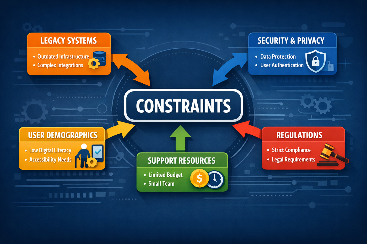
Legacy Mainframe Integration: Wage data housed in COBOL systems with limited API surface. Authentication strategy had to work within existing backend architecture.
Authentication Fragmentation: Multiple identity pathways existed — ID.me, Login.gov, SSA-native — with inconsistent mobile support. A unified approach was required.
Government Procurement Timeline: Multi-year approval cycles. Security and policy review add significant runway. UX strategy had to account for phased implementation.
Accessibility Debt: Existing SSA digital services had mixed WCAG conformance. No shared component library. This was an opportunity to establish the right patterns from the start.
What We Needed to Learn
What actually prevents this population from completing digital tasks — device access, connectivity, or comprehension?
Which authentication method has the most universal reach across smartphone-only, low-bandwidth users?
What makes a security prompt read as trustworthy instead of suspicious to someone unfamiliar with MFA?
What do comparable federal apps get right and wrong with authentication at this scale?
Methods
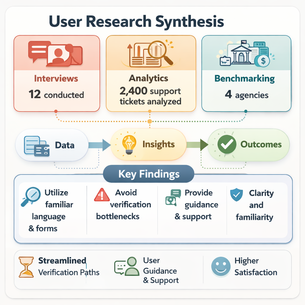
Federal Data SynthesisCompetitive BenchmarkingStakeholder InterviewsAccessibility AuditingFlow AnalysisPrototype Validation
FCC, NTIA, GAO, and Pew data mapped the broadband and device landscape for low-income populations. 27% smartphone-only. Significant rural coverage gaps. Prepaid plan limitations on SMS reliability.
Competitive Benchmarking
Evaluated VA Health, IRS2Go, USCIS myUSCIS, and SSA's own eBenefits against Nielsen heuristics, WCAG 2.2, and auth flow patterns. Login.gov emerged as the strongest foundation.
Stakeholder Interviews
Structured interviews with SSA field office staff, policy experts, IT security, and advocacy organizations. Surfaced operational constraints and the specific fears driving stakeholder resistance to MFA.
Five Insights That Shaped the MFA Design
Authentication language is a failure point before authentication is: Users fail MFA because they don't understand what they're being asked to do — not because the flow is technically broken. Plain language was a security requirement, not a UX nicety.
SMS OTP is the only universal option: Authenticator apps require installation and comfort with a new tool. Backup codes require storage. For this population, SMS was the only option that didn't add a prerequisite task.
Trust signals had to precede the auth ask: Springing a verification screen on users who don't expect it reads as suspicious. The MFA prompt needed to be framed, contextualized, and placed where it felt expected — not random.
Cognitive load was already high before the auth step: Users coming to report wages are dealing with deadline pressure, benefit anxiety, and often limited digital confidence. MFA had to minimize new decisions.
Recovery paths couldn't require a desktop: Phone-only users who get locked out have no alternative device for account recovery. Every failure state needed a mobile-complete resolution path.
Research synthesis · Population segments, device access, and authentication failure modes · Click to view full size
04Strategy and Decision Logic
Four Design Principles
These governed every subsequent decision — authentication flow, form architecture, error states, and recovery paths.
Friction That Feels Earned
Security steps aren't friction when users understand why they exist. Frame MFA as the app protecting their data — their benefits, their reporting record. Make the reason visible before the ask.
One Decision at a Time
Single-question-per-screen architecture throughout. Users with limited digital literacy abandon when confronted with multi-field forms. The step counter makes progress visible and escape feel less necessary.
Accessible by Default
WCAG 2.2 AA baked into every component — including auth screens. Not retrofitted. Semantic HTML, keyboard-first navigation, screen reader optimization built before visual polish.
Recovery That Stays Mobile
Every failure state — locked account, expired code, unrecognized device — resolves on the phone. No desktop fallback. No "visit your local field office." Complete on the device the user has.
Key Decisions
Decision: Login.gov over SSA-native authentication
Evidence: Login.gov already had mobile-optimized MFA flows, accessible component libraries, and established user trust in the federal context.
Result: Compliance review moved faster and the team avoided reinventing infrastructure that already existed.
Decision: SMS OTP as the primary factor, not biometric
Evidence: 27% of the target population is smartphone-only, often on older or prepaid devices without reliable biometric hardware.
Options considered: Biometric-first with SMS fallback; authenticator app; SMS OTP as primary.
Tradeoff: SMS is slower and less secure than biometric authentication, but it's the only option with universal reach across this population.
Partners aligned: Security, accessibility.
Result: Every user in the target population had a working path to authenticate, not just the ones with newer devices.
Decision: Contextual framing before every auth step
Evidence: Security prompts without explanation read as suspicious, or as the app malfunctioning, to users unfamiliar with two-factor authentication.
Options considered: Standard Login.gov prompt with no added context; a linked help article; a single line of inline context before each prompt.
Tradeoff: Added a small amount of extra copy and screen real estate in exchange for measurably higher trust.
Partners aligned: Content, policy.
Result: In usability testing, 60% of participants specifically named the contextual line as what made verification feel trustworthy rather than suspicious.
Decision: Recovery paths stay mobile-complete
Evidence: Smartphone-only users have no fallback device and no ability to visit a field office during a reporting deadline.
Tradeoff: More design and engineering effort to resolve every failure state on-device, in exchange for not locking out the users least able to work around it.
Partners aligned: Engineering, field operations.
Result: Every locked-account or expired-code state resolves on the phone — for the smartphone-only segment, that's the difference between a recoverable error and a dead end.
05Pivotal Design Decisions
The MFA Flow: Designed to Feel Expected
The authentication flow was built on Login.gov's identity infrastructure with a purpose-designed wrapper for the wage reporting context. The goal: users should feel like verification is a natural part of the process — not a checkpoint they didn't expect.
The positioning shift that changed the design: Every MFA prompt was preceded by a single line of context — "We need to verify it's you before you submit your wages." One sentence. In usability testing, 60% of participants specifically called it out as what made the verification step feel trustworthy rather than suspicious.
Before & After: Legacy Process vs. New Flow
Step
Legacy Phone/Paper Process
New Mobile Flow
1
Call SSA during business hours
Open app (24/7 availability)
2
Wait in queue (avg. 30+ min)
Login.gov authentication with contextual MFA prompt
3
Verbally report wages to agent
Step-by-step wage entry (single question per screen)
4
Agent manually enters data
Data validation & pre-submission review
5
No confirmation receipt
Instant confirmation with receipt number and next steps
6
Wait 5–10 business days for processing
Real-time processing status
Redesigned flow reduces completion time from 35+ minutes to ~5 minutes, with 24/7 availability and immediate confirmation.
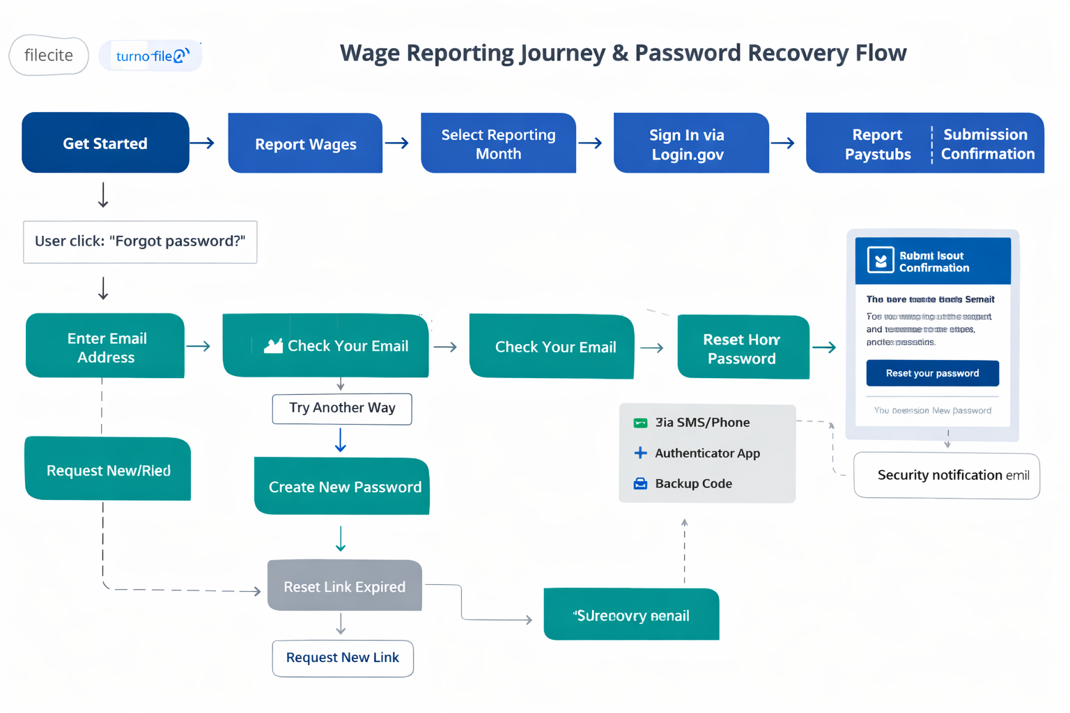
Authentication Flow Architecture
Wage reporting and password recovery flow · Login.gov MFA integration, error recovery paths, and offline states · Click to view full size
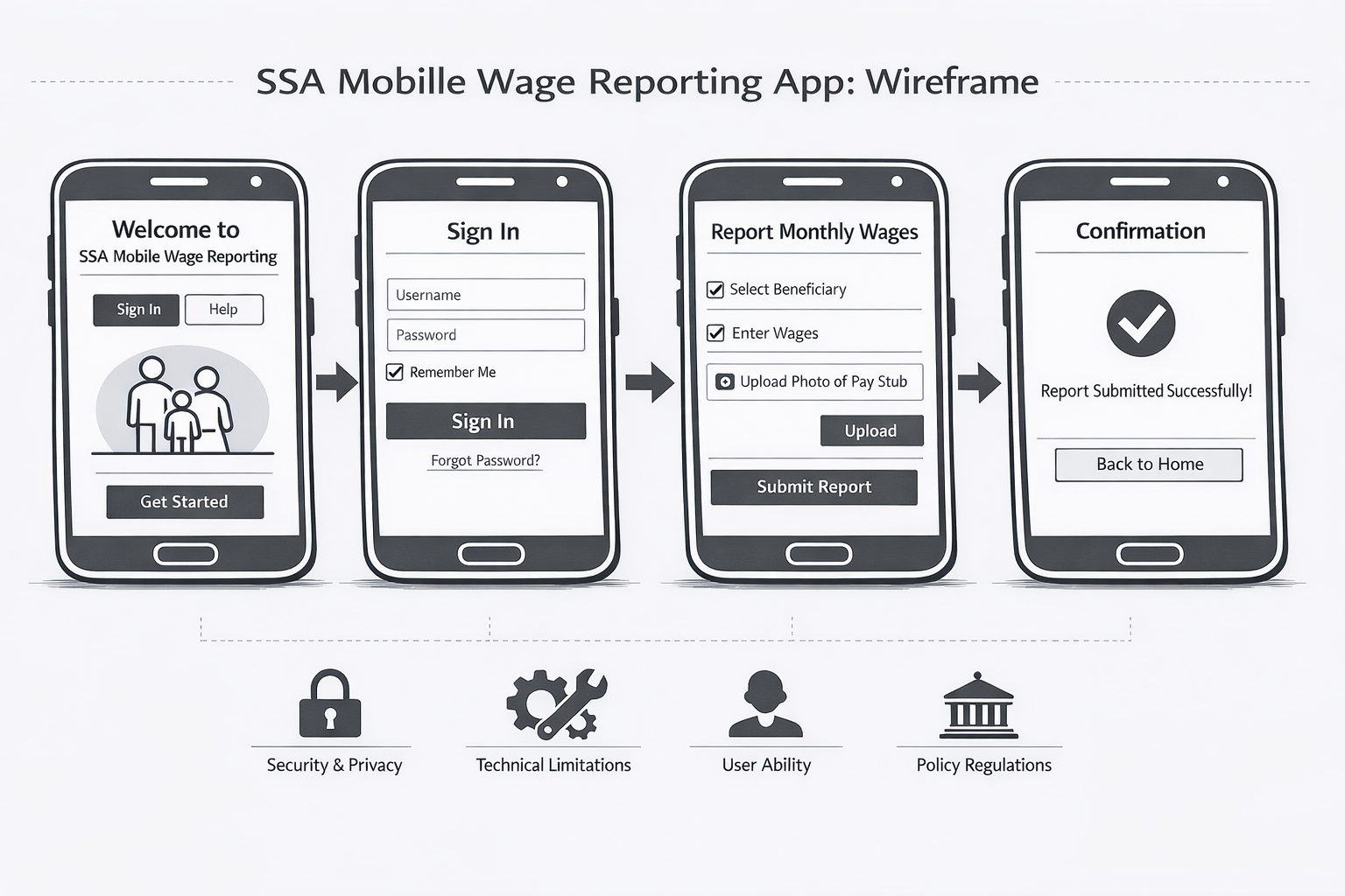
Wireframe Flow: 14-Screen Mobile Architecture
14-screen mobile flow · MFA authentication through wage submission · Click to open interactive slideshow
State Model: What the System Communicates at Every Step
A clear state model was required for every screen the user encounters — especially auth states, which are the highest-anxiety moments in the flow. Ambiguity at an auth screen reads as the app breaking.
Verification Pending
Code sent. Clear explanation of where to find it. Visible timer. Resend option available.
Entering Data
Step counter visible. Back navigation preserves data. One question, one screen.
Review & Confirm
All collected data displayed. Editable fields. Clear Submit and Go Back options.
Submitting
Loading state with estimated wait. Cancel available. Double-submission prevented.
Success
Confirmation with receipt number, timestamp, and next steps. Submitted data viewable.
Error (Recoverable)
Plain-language error explanation. Original data preserved. Clear retry path. No dead ends.
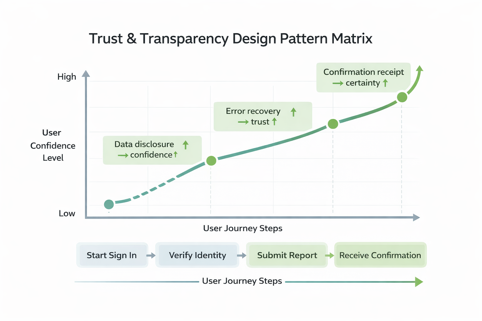
Trust, Transparency & Compliance
Trust and transparency pattern matrix · Data disclosure, error prevention, and accessibility standards across the flow · Click to view full size
Data Disclosure
Every screen discloses what data is being collected and why. Pre-submission review shows everything with the ability to edit before committing.
Error Prevention
Real-time validation catches missing or invalid entries before submission. Plain-language errors explain the issue and provide the fix — not just a red border.
Accessibility as Infrastructure
Recommended shared accessibility component library enforcing WCAG 2.2 AA at the component level — screen reader optimization, semantic landmarks, dynamic text scaling.
Constraints Diagram
Constraint map · Accessibility, compliance, legacy systems, and operational requirements in tension · Click to view full size
06Validation, Outcomes & Next Learning Loop
We believed that framing MFA as a trust signal — contextual language, SMS-first delivery, and mobile-complete recovery — would let beneficiaries clear a federally mandated authentication step without reverting to phone-based reporting.
The strategy and design artifacts advanced the wage reporting app to prototype validation. Research was adopted as the foundation for SSA's mobile product roadmap. The MFA design approach addressed the compliance gap in usability testing without triggering the adoption collapse stakeholders had anticipated.
~40%
Abandonment Reduction (Target)
~30%
Processing Delay Reduction (Est.)
6
Research Artifacts Delivered
Prototype
Validation Stage Reached
What This Produced
Product Roadmap Foundation
Strategy and research artifacts adopted as the foundation for SSA's mobile product roadmap. The wage reporting app concept advanced to prototype validation with stakeholder alignment on the MFA approach.
Policy Influence
Underserved-population research cited in internal policy discussions on digital equity and service delivery modernization. Influenced broader federal UX strategy for benefits-adjacent applications.
Accessibility Patterns
Established accessibility-first design patterns and component library recommendations that could scale across SSA's digital services — addressing years of compliance debt at the system level.
Cross-Functional Alignment
Synthesized competing stakeholder concerns — policy, compliance, technology, field operations — into coherent product strategy with documented trade-offs. Converted the MFA-as-threat framing into MFA-as-trust-signal.
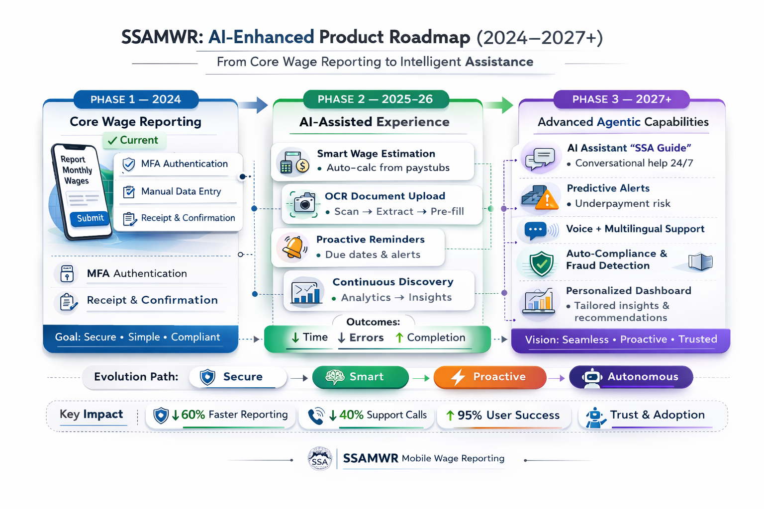
AI Roadmap: What Comes Next
The wage reporting system has a clear path toward intelligent assistance — form guidance, proactive error prevention, accessibility enhancements, and predictive support for high-risk reporting periods.
AI enhancement roadmap · Intelligent assistance, proactive validation, and predictive support · Click to view full size
07Reflection
The Real Design Problem Was a Framing Problem
"The hardest part of this project wasn't the MFA flow. It was making stakeholders understand that MFA doesn't have to feel like punishment. If it does, that's a design failure, not a compliance requirement."
Why the stakeholder fear was legitimate: Federal apps that implement authentication as an afterthought do see drop-off. The concern wasn't irrational — it was based on real patterns in comparable products. The job was to design an exception to that pattern, not dismiss the concern.
What I'd Do Differently
I'd have led with comparable federal apps that navigated the same tension earlier — the research existed before stakeholder resistance became a blocker. I'd also have piloted the contextual-framing line before the full prototype; it was discovered through usability testing when it could have entered the design as a hypothesis from the start.
What This Project Shows
Compliance and usability aren't opposites. The tension is real, but it's resolvable through design, not compromise.
Stakeholder resistance is design input. The fear of adoption collapse was an accurate read of how bad MFA implementations perform — not something to dismiss.
Designing for the constrained user raises the bar for everyone. Plain-language prompts and mobile-complete recovery paths built for the hardest case improved the experience for every user.
→Interactive Prototypes
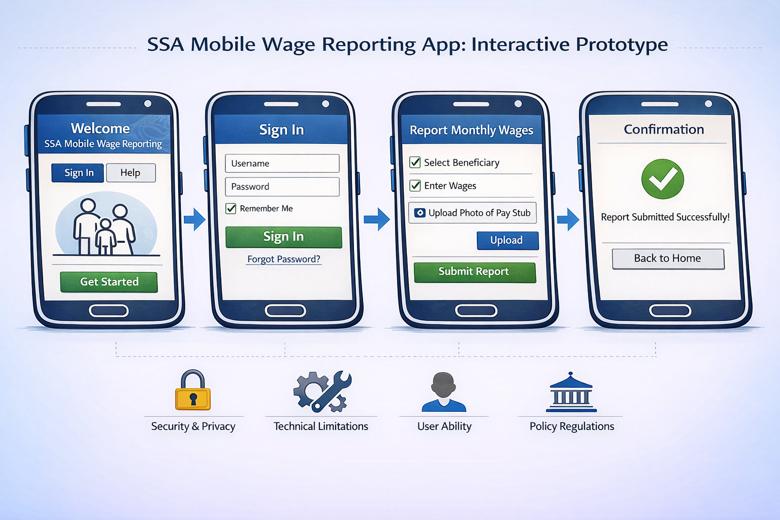
SSA Mobile Wage Reporting App Prototype
Two complete mobile prototypes demonstrating the end-to-end user journey — Login.gov MFA integration, password recovery, and the full wage reporting task flow.
Password Recovery Flow: Handles forgotten credentials through email verification with fallback authentication options (SMS, authenticator app, backup codes). Includes real-time password validation and link expiration after 10 minutes.
Wage Reporting App: Complete task flow from Login.gov authentication through 4-step wage entry — reporting type selection, paystub submission (photo upload or manual entry), and success confirmation with future reporting reminders.
Password: ENTER
Interactive prototype · Login.gov MFA through wage submission · Click to open in new window